8. An image of the Silver Surfer was originally considered for the album’s cover.
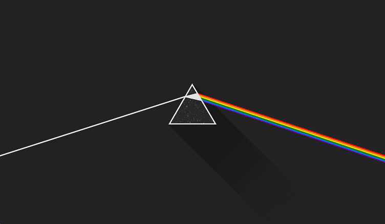
With its evocative, eye-catching graphic of a prism turning light into color, Dark Side of the Moon‘s album cover – created by English graphic designer George Hardie with input from Storm Thorgerson and Aubrey Powell of Hipgnosis – is one of the most iconic designs to ever grace an LP. “When Storm showed us all the ideas, with that one, there was no doubt,” Gilmour recalled to Rolling Stone in 2003. “It was, ‘That is it.’ It’s a brilliant cover. One can look at it after that first moment of brilliance and think, ‘Well, it’s a very commercial idea: It’s very stark and simple; it’ll look good great in shop windows.’ It wasn’t a vague picture of four lads bouncing in the countryside. That fact wasn’t lost on us.”
So it’s interesting to imagine the album with an entirely different cover – specifically, the one suggested by Hipgnosis that would have featured an image based on the comic book character the Silver Surfer. “We were all into Marvel Comics, and the Silver Surfer seemed to be another fantastic singular image,” Powell recalled in an interview with John Harris. “We never would have got permission to use it. But we liked the image of a silver man, on a silver surfboard, scooting across the universe. It had mystical, mythical properties. Very cosmic, man!”
One thought on “Pink Floyd’s ‘Dark Side of the Moon’: 10 Things You Didn’t Know”